OK. I’m not a designer, so take my comments with that in mind.
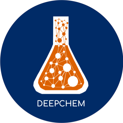
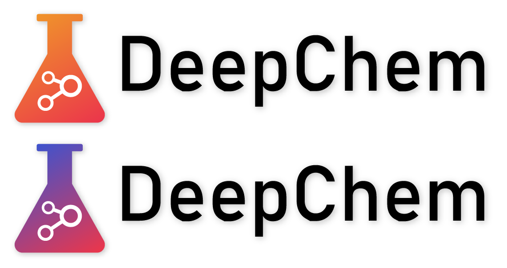
I like the simplicity of the logo - almost like you are capturing a dense graph or neural network within a beaker! Very cool idea.
These are my very small nits:
- The beaker looks like it has a cap or top ( possibly a titration nozzle? ). Because of it, it can appear a little like a perfume bottle.
- With lower resolution icons, the connected nature of the “network” might get lost.
Otherwise, I think it’s fantastic, and I prefer the any of the blue background ones.
