Refreshing the DeepChem Logo

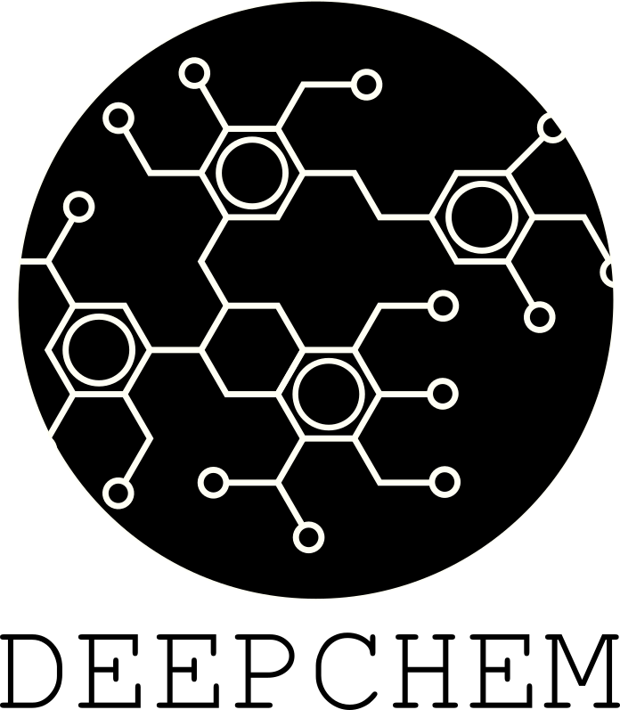
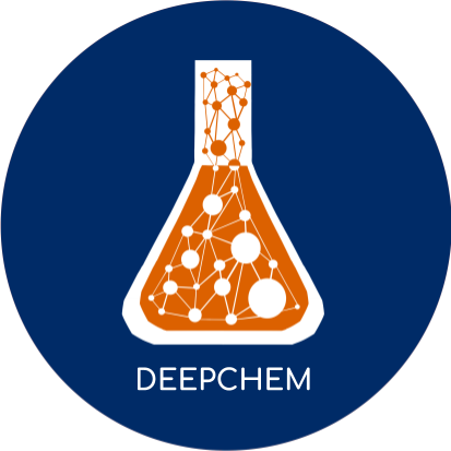
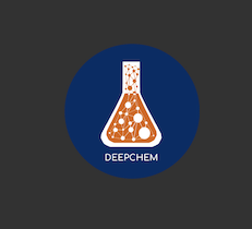
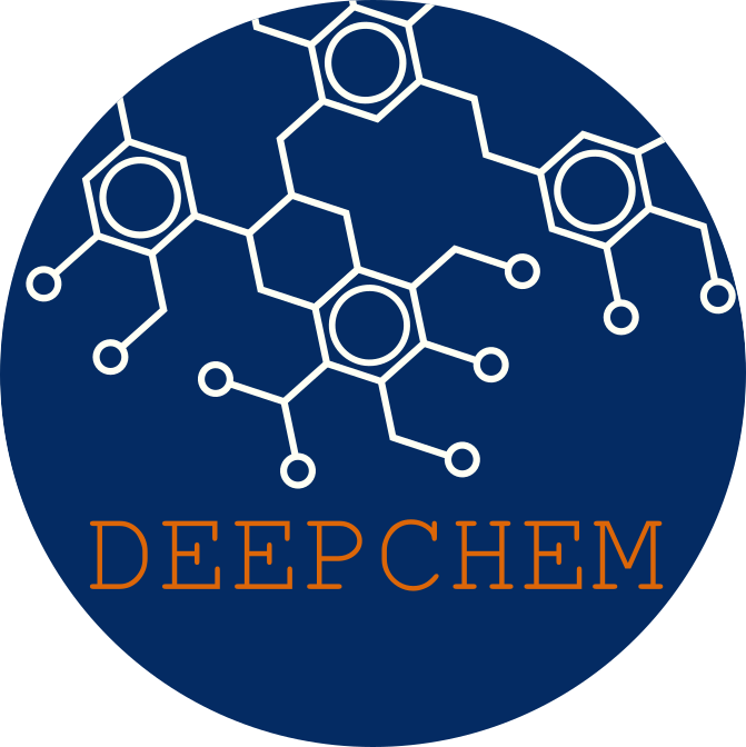
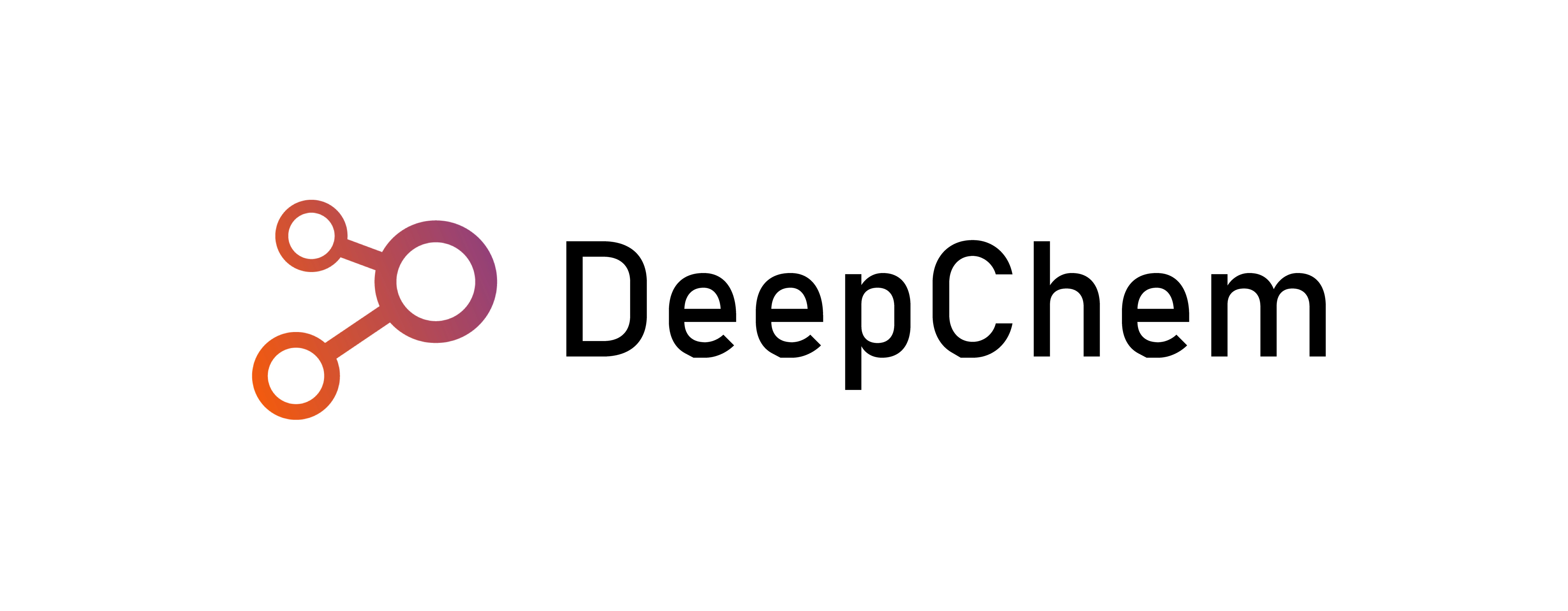
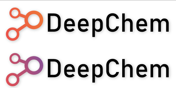
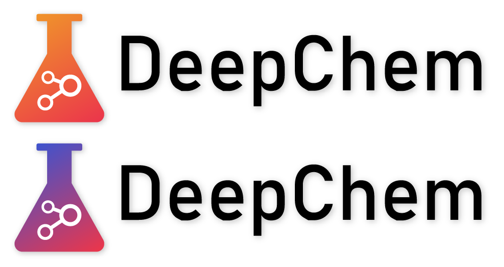
Our original DeepChem logo was designed in 2015 by @aanara. It’s served us well and is pretty widely recognizable. However, DeepChem has evolved considerably as a project over the last several years, so it might be time to consider some new logo designs. @aanara has been kind enough to put together some new potential logo designs for us to consider.

2020_3_13_DeepChem_Logo_Round

DEEPCHEM Round 2

DEEPCHEM 5

DEEPCHEM 4

DEEPCHEM 3

DEEPCHEM 6

These are just starting ideas, and I want to open out the search for logos to the whole community. If you have an idea for a potential logo, please feel free to add on in this thread! I figure we can have a vote once this issue has been open for a while :slight_smile:

3 Likes

Very cool! Are you looking for feedback on just the color palette, or different iconography as well?

1 Like

Feedback on all of the above is welcome! If there’s a different iconography we feel is more representative of “modern deepchem” we could well consider swapping the logo

Very nice! I like the second one best. It keeps the existing DeepChem color palette, and the text is more readable than some of the others. White text on a red background doesn’t have good contrast.

1 Like

OK. I’m not a designer, so take my comments with that in mind.

I like the simplicity of the logo - almost like you are capturing a dense graph or neural network within a beaker! Very cool idea.

These are my very small nits:

  • The beaker looks like it has a cap or top ( possibly a titration nozzle? ). Because of it, it can appear a little like a perfume bottle.
  • With lower resolution icons, the connected nature of the “network” might get lost.

Otherwise, I think it’s fantastic, and I prefer the any of the blue background ones.

2 Likes

I think the already suggested Deepchem Logos look really nice.
But I agree with @gosha1128 maybe the finer lines will get lost with lower resolution.

I recently made a quick sketch for the Github page of my group. I took the basic example and it could also work for DeepChem (although not a 100% chemically correct).
If people like it I could also work on different color combbinations

logo_nnmol_deepchem

2 Likes

Thanks for the feedback! I passed it on to @aanara (who’s not on these forums) who put together an alternative cut of the logo without the cap. How does this one look?

DEEPCHEM No Lid

This is great! I’d love to see variants in a few other color schemes. Perhaps blue/orange to match the existing DeepChem logo color scheme?

I tried shrinking down this cut of the logo to see how it would look lower resolution:

Screen Shot 2021-01-26 at 8.03.25 PM

This would be two variants with the OG Colors :slight_smile:
logo_nnmol_large_wbo logo_nnmol_deepchem_bo

2 Likes

Just exploring some new ideas. I like minimalist logos.

Sem título-2

2 Likes

Sem título-1

2 Likes

These are great! If you’re open to color tweaks, these might look really nice in the OG orange/blue colors :slight_smile:

1 Like

Sure! Here it is.

deepchem1 deepchem2

5 Likes

I love this one! Definitely my favourite so far (the original beaker one also being really nice).

3 Likes

Also really like @ThiagoReschutzegger one with the current colors… would look awesome like this…

Symbol also seems abstractly related to science as well as machine learning.

deepchem

2 Likes

Awesome idea @vincentweisser:
image
Keeping the original beaker (@seyonec ):
image

(The forum does not allow .svg or .ai files)

2 Likes

Also really like the first version for its simplicity

1 Like

https://drive.google.com/drive/folders/19c-cHxPQ8m-e8wwtdlPTLyVaU-trHi-o?usp=sharing

1 Like

This looks great! Especially the D in DC! :heart_eyes:

1 Like